
Social Proof
Because we want to know someone else has tried and liked it before we do.

After writing my article about Why I Revamped Split It, I started a series on what I have learned about building products and managing the tradeoffs between product and engineering. Last week, I talked about why the user is always right.
This week’s topic is social proof.
When we are trying something new, we often ask ourselves “Is this thing good, useful, and/or valuable to me?” While this is hard to answer, we are incredibly social creatures, and we use this to our advantage.
For example, before I decide to watch a movie, I often rely on two heuristics:
Have my friends recommended this movie?
How did people rate it on IMDb?
While these don’t always map 1-1 to the enjoyment I get from watching a movie1, they’re pretty reliable proxies. If you’re watching Shawshank for the first time, you can be pretty sure it will be good because your friends rave about it, and because most people agree it’s a fantastic film.
The same is true for restaurants, music, podcasts, vacation destinations, neighborhoods in Chicago, art installations, recipes, books…the list goes on and on. We want to know that others have had a good time, because life is too short to waste on bad experiences.
The same is true for software applications.
Users often need validation that an app is worth investing their time, and given the complexity that is often baked into a software product, the social proof element goes quite a long way.
There are two types of social proof: my friend’s stamps of approval (i.e. movie recommendations) and what I’ll call “collective validation” (i.e. IMDb ratings).
On the home screen of Split It, I added some collective validation in the form of metrics. These metrics say that around 5,000 people trusted it enough to try it once. While this is not a ton of users by any means, these numbers demonstrate the app’s competence. Someone will stumble on this page and think: “thousands of people can’t all be wrong.”

While I know that metrics can be gamed, and people can stretch the truth about the numbers, the reality is that there’s still a sense of comfort in seeing the social proof. It’s the same way that seeing recognizable logos in a “who we work with” on a company’s website makes you trust that company a bit more. It may not fully make up your mind on whether or not to use a product, but the collective validation demonstrates some form of competence.
The other form of social proof is the stamp of approval. I implemented this in a few places, but the most important place is on the “join a check” page, which is often a new user’s first time seeing the app.
Encouraging viral growth among the people using it was important for Split It, but I did not realize that right away. And I certainly did not realize that highlighting stamps of approval and other social proof is a key to building trust with users.
Let’s take a look at this page circa 2021 vs. the new “join a check” page.

These do the exact same thing from a technical perspective, but if you were asked to use one, which one would you choose?
For me, I would choose the one that subtly says “Cory has taken time to vet this app and trusts it to solve our problem of splitting the bill.” In addition, at the bottom, it is clear that Stephen is using it as well, and at least somewhat endorses it, thus continuing to build trust with me, a first-time user. This is often the user’s first time ever seeing this app, and the social proof is pivotal.
In 2021, someone would land on the page and think to themselves “What is this? What do I do with this? Why did Cory send me this link?”2.
In 2025, when someone lands on the page, they are immediately greeted with “Cory wants you to split the bill, and he knows it’s kinda awkward to ask for money, so he is using this app to make it fun.” This message resonates a lot better with me (and others), and I am so glad I changed it. What I realized was that every time someone tried Split It, I had to give them that explanation anyways, so I finally decided to code it into the app and add some social proof in the form of a stamp of approval.
I’ll also mention here that a simple “How it works” box goes a long way to easing a user’s apprehension about a new app, but I’ll write about that in next week’s post.
Another example of stamps of approval is in adding user images to checks. Before I made this change, everyone had a nice unique color, so that it was easy to visually parse. But I realized it still felt stale, sterile. I wanted it to be friendlier and more inviting. What better way to make it friendlier than to put someone’s friend’s photos on the page.
I added a user’s photo to the list of participants, while still keeping the color for ease of visual parsing.

I also added the same color and photo to each item that the user claimed.
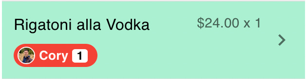
The simple act of adding a photo did two things. First, it made it more social and fun. It took the app from “this is a neat little utility” to “this is a fun way to split a bill with my friends”.
Second, it made it clear that this is not a one-off app, but rather something that you can sign up for and use repeatedly. While I put buttons for users to create an account in several places in the check screen, I did not start seeing users sign up until I added their friends’ photos to the page.
This makes total sense in hindsight3. Let’s say I am a first-time user. Before, if there were two people who had signed up and repeatedly used the app, there was no way for me to know, and it didn’t matter.
However, after the change, if there are two people using the app, and they both have photos on the page, I am immediately missing out by not creating an account. It creates a sense of FOMO, and of course I don’t want to be left out.
Before, it was just a color. Now, it’s a person. What a difference social proof can make.
By adding elements of social proof, both in the forms of collective validation and stamps of approval, I have noticed Split It begin to gain more traction. But more importantly for me, I have enjoyed using it more. It went from a utility to a fun social experience that I can see populate in real time as people claim items they had at a table.
Clearly, Split It was destined to be a social app, I just didn’t realize what that meant when I built it in 2019. But now, with some very simple tweaks, it has become a fun and magical experience.
Until next week,
Cory
My brother loved and recommended “A Real Pain,” but I couldn’t stand Kieran Culkin’s character. To each their own.
The screen from 2021 is my first stab at front-end development, well before I understood either the UI or UX (user interface or user experience) mechanics to make it better and more intuitive. It’s fun to look back at how much I’ve learned in the process.
I’m great at predicting things in hindsight.