
Make it Easy for your Users
Give them a chance to give your app a chance.

Welcome back to Jab’s Lab. A few weeks ago, I wrote an article on Why I Revamped Split It, my side project that I first launched in 2019. Since then, I started a post series unpacking my learnings about products and engineering, both from the revamp of Split It as well as throughout my time as a product-focused software engineer.
Over the last two weeks, I have talked about why the user is always right and social proof, and have given examples from the revamped version of Split It to make the concepts more concrete.
This week’s topic is making it easy for your users. Let’s dive in.
Last week when talking about social proof, I wrote:
When we are trying something new, we ask ourselves “Is this good, useful, or valuable?”
These are good questions, but they don’t tell the full story. It’s not enough for a user to just answer “I find value from this.” A user has to answer “I find value from this, immediately.”
To get a user to try your product, you have to create immediate value for them. There are so many apps out there, and people have very limited time and attention to try a handful of recommended apps. They will only give your app a few seconds, minutes if you’re lucky. No matter how good your app is, or how useful your platform may be once you unlock its full potential, you have to earn the right to show them more than a few features. If your app isn’t immediately easy and useful, you won’t earn the right to show people the rest.
The best way to do this is to focus on the core feature(s)1, and make them as easy as possible. In the case of Split It, the core feature is being able to split a bill fairly, transparently, and socially among friends.
When I started to revamp Split It, I had three goals in my mind:
Make it as easy as possible to split a bill.
Make it fun, social, and transparent.
Encourage more people to consistently use Split It.
I realized there were several parts to this mission, and all of them were important. First, I needed to make it easy for a brand new user who has never heard of Split It to join and split a bill that someone else created. Then make it easy to create an account. And eventually, make it so easy that they feel empowered to pick up the check at a restaurant, knowing they will get paid back using Split It.
Making Split It Easy for the Users
To show you what “making it easy” looks like in practice, let me take you behind the scenes of Split It’s redesign. These examples show the decisions that went into the product, and how each had the goal of reduced friction for users. You will see some side-by-side screenshots to compare the old experience vs. the new experience. And while I use Split It as the example, please know that the learnings are pretty universal.
Let’s start by putting ourselves in the head of a new user2, and take you through the user journey. They have never heard of Split It besides seeing this link show up in their messages from a friend:

They may be intrigued, but they still have several questions about what the app is, how it works, and what it can do for them3. Since they probably heard about it from a trusted friend, they have enough reason to try it out. So they click on the link, and see this screen. Let’s break down the improvements between the old version (v1) and the new version (v2).

The Header
v1: ❌ “Join Check By Share Code” → As a new user, I am immediately baffled by this title. I don’t know what a check is, I certainly don’t know what a Share Code is, and I don’t know why my friend sent me this link in the first place.
v2: ✅ “Split the bill for Bar Siena” → As a new user, this immediately answers some questions for me. My friend picked up the check, and they are using this app to split the bill for the restaurant that we just visited (Bar Siena).
The Subtitle / How It Works
v1: ❌ → Yeah, this doesn’t exist in V1. People have no context of what the app is, how to use it, or what it will do for them.
v2 ✅ → In v2, people have the context to know (1) what the app is, (2) what it does, and (3) how it works for them. Because the default for check splitting is someone sending out Venmo requests, it felt important to clarify that you, the user, are responsible for claiming what you had and paying your friend back. Also, adding the name of the “check owner” makes it clear that Cory set something up here and wants to get paid back. Some subtle social proof in action.
The Share Code
v1: ❌ Enter it manually in a text box → This is confusing because people don’t really know what a Share Code is, it’s not a typical pattern, and it feels like a passcode from Zoom that everyone is annoyed is not included in the link.
v2: ✅ Hidden, included in the URL → This is a great example of the power of a link. Nobody should have to worry about this technical concept, especially when it’s not important to the user experience, it’s just a way of getting the right data.
Your Name
✅ Not much changed here. Nice work, 2019 Cory.
Join Check Button
v1: ⚠️ “Join Check” → Not bad, but still unclear what a Check is and why I’m using this website.
v2: ✅ “Join bill to Split It” → More clear, especially given the other context above. Also it makes it clear why “Split It” is the name of the app. A fun, cheeky way of introducing the app as a whole.
Others
v1:
❌ ❌ ❌ “If you are not signed in, you will not be able to view your check again” → What is this? It’s so ominous! It’s basically saying “Beware of the danger here, new user. You are not safe.” Far from the best way to encourage a new user to try it out.
v2:
✅ Sign In button → This is important to show that this is not just a utility, but rather an app that you can sign up for and use consistently for all of your bill splitting needs. Even if you don’t have an account, you already have the seed planted to create an account and use Split It moving forward.
✅ Already splitting → Even more fun social proof to show that you’re not just giving your name to a random website. At the very least, Cory and Stephen are already using it.
While none of the changes individually make a huge difference to the user experience, together, they really add up. All in all, v2 does a much better job of anticipating and answering a new user’s questions about the app, and gives them a sense of what to expect for the rest of the experience.
Once they join their first check and pay their friend back, ideally, they would be blown away by the ease of the experience. Hopefully, they would create an account and become a champion of the app. Pick up every check, and be sure they’d get paid back. To make this happen, I needed to make it easier to go from paying a bill at a restuarnat to getting paid back.
With this in mind, revamping the “Create a new Check” page was a crucial part of the process. If people couldn’t enter their own bills easily, then Split It would never grow organically. People would use it, they would like it, and then they would forget about it.
I ended up making several changes to the “Create a new Check” screen, each designed to make it easier to use. Again, let’s go over the improvements one by one. The changes individually may not seem big, but together, they make the difference between someone using Split It instead of Excel to split their check4.

Header
v1: ❌ “New Bill” → Not very clear for a first time user how to use this app.
v2: ✅ “New Split” + Venmo + Stepper → These elements make it much easier to know what you have to do to create your first check. The Venmo payment info box answers the user’s first question: “how will people pay me back?” and the stepper answers the second question: “how hard is this to set up?” Both convey the ease of use of the app, and encourage people to continue through the process.
Tax, tip, adding Items to the Check
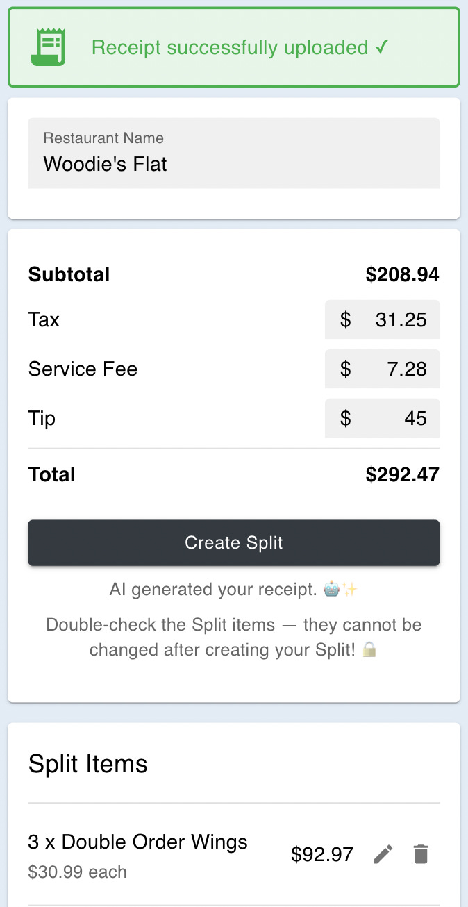
v1: ❌ Manual process, enter each item individually → This works well for a proof of concept app, but it gets tedious for more than 5 items5. This is too hard and tedious. We need to make it easy.
v2: ✅ Upload a receipt photo or screenshot, then verify→ This used to be the most widely requested feature for Split It, and I finally built it. It was tedious to enter each item manually. With the image upload, however, you no longer have to enter restaurant name/tax/tip/service fee/items, these are parsed for you using OpenAI image processing6. It’s not always 100% correct, but users can edit items after the fact. It makes it significantly easier by overcoming the manual entry hurdle.
Once you create the check, the claiming and Venmo process is about the same, but I did make some small tweaks you’ll have to try out yourself the next time you need to split a bill.
Lastly, since the goal is to make it as easy as possible, I made sharing the check possible at the table. With the inertia of just having paid the check, a person is motivated to get paid back immediately. By adding the QR code to the share screen (instead of just copying the link in v1), it became much easier for everyone to scan and immediately Split It, right at the table. What went from an awkward experience after the fact became a fun, social experience in real time at the table.

I am pretty confident that once someone creates one check, they will want to continue to use the app, since it’s both convenient and removes the friction people experience with group dining. The hard part is getting someone to overcome the hurdle of creating their first check. This is why it’s so important to walk them through the flow and make it easy.
What’s next in terms of making Split It easy for users? I need to make it much easier to go from sign-up to creating your first check. The obvious answer is to implement an “onboarding” flow walking a user through the product after they sign up. Or maybe I’ll make it easier to add Split It as a PWA to your home screen, to make it an app-like experience to encourage repeat usage.
As you look at your product, I encourage you to ask yourself: where can I make this easier? Are there quick wins that will be meaningful to my users? What small things can I change that may add up to an overall lift in user experience?
While some of the improvements may not seem huge, if you pick just a handful of low-hanging fruits, your users will notice a big difference. In the meantime, I’ll keep doing the same.
Until next week,
Cory
If your app has multiple “core features” at the beginning, I would encourage you to think harder about what problem your app is solving. Most successful apps solve one very specific problem, well, and grow from there.
If you’ve never used Split It, here’s your opportunity to see it in action a bit!
And they probably wonder how it differs from Splitwise. Let me set the record straight. Split It and Splitwise, while similar in helping you get paid back, aim to solve completely different problems.
Splitwise is great at collecting many expenses across a number of transactions, and giving people the ability to split them evenly and fairly. It allows a large group of people to settle up when many different people paid. It’s great for roommates who frequently have shared expenses or trips where people pick up bills.
Split It solves a fundamentally different problem: if everyone had different things at a restaurant, how can we each fairly pay our share of the bill? Split It helps people split a single bill fairly, and removes awkward social interactions such as “who will pick up this bill?” “If I pick it up, will I get paid back?” or “I’m a vegetarian, should I have to pay for the shared appetizer that has meat in it?”
Or worse: splitting it evenly.
I did make it easier to add items in a v1 upgrade, using a single input like “<quantity> <name> <total price>”, but even so, the manual entry is just hard enough to give people a reason not to use the app. And remember, we’re trying to make it easy. Give them a chance to give us a chance.
While many people want to plaster the phrase “AI powered” across their app, I decided to remove the phrase “AI” in most places. I am convinced that people don’t care what the technology is, as long it solves their problem. “AI” is not a value proposition. What it unlocks (e.g. receipt parsing) is a value proposition. I’m debating removing the “AI generated your receipt 🤖” line, but I think it’s important for users to understand it may have mistakes, so they should double check the work AI did. It’s another example of the AI input → human confirmation flow that I think will become a common pattern in the future.