

In my article Decisions, Constraints, and Tradeoffs, I talk about how a product is just the result of a thousand micro-decisions. There’s always a delicate balance between pursuing perfection and shipping incremental changes.
In reality, there’s no such thing as a perfect product. Often, I get to a point in my work where I think “this is perfect, this is the final form.” But then I’ll look back at it months later and realize that there are still improvements to be made.
I can see where this process could be disheartening to some, but for me, it’s energizing. Every time I make a change, it means that I (1) have learned something new about my users and (2) want to solve yet another problem for them.
I am not a huge fan of wholesale changes to apps, because they often sacrifice user familiarity for the sake of being “new”. But when you can identify specific pain-points in someone’s workflow and resolve them, those are the incremental improvements that stick with people.
Your small changes may go completely unnoticed to the user, and that’s the ideal state: where software fades into the background and the user can simply accomplish their goal. There’s a beauty and art form where you build a product that so easily fits to someone’s workflow that they don’t even notice the tool they’re using.
It’s something that brings me a lot of joy to think about with Split It: people at a restaurant getting together to have a meal, and at the end, they get to continue their nice time, not worry about who’s picking up the check. It’s not life-changing, but it makes people’s lives better every week, so I am excited to keep improving it for them.
Finding the Small Improvements
While building a product is hard, if you take it one step at a time, it becomes much easier. Instead of thinking “I need A-Z features” to be successful, maybe start with just A. Then move on to B, at which point C will be abundantly clear. Too often people get caught up in the end state, but that’s looking at it wrong.
In any product, there is no end state, just the current state.
There’s always improvements to be made, as I keep learning every time I think I’ll stop developing on Split It for a while. And every time I make an incremental change, I feel a sense of pride in solving a customer problem slightly better.
The process of finding small improvements very rarely starts with “I want to improve this product, so I am going to identify changes that will help.” Manufacturing improvements without being conscious of the ways customers use your product is a dangerous plan. At best, it leads to a slightly better user flow, but at worst, it leads to over-building, feature bloat, and a product that lacks cohesion.
So instead, I start by empathizing with the customer, identifying their problems that are not being solved by what’s currently in place. In the case of Split It, that is quite easy, because I am a customer. I then combine that personal experience with other methods: taking customer feedback, going through flows, and trying to see the product with new user eyes. Every once in a while, I’ll even delete my account, sign back up, and see what the onboarding experience holds.
Every time I do this, I seem to find a number of things that could be improved. And while there’s never enough time to fix everything, it’s really satisfying to identify a better flow, an experience with slightly less friction, or a new bug that may have been plaguing users for months.
Case Study: The new Split It Claiming System
Let’s start with the biggest change I’ve made to Split it since the revamp last year: the claiming process.
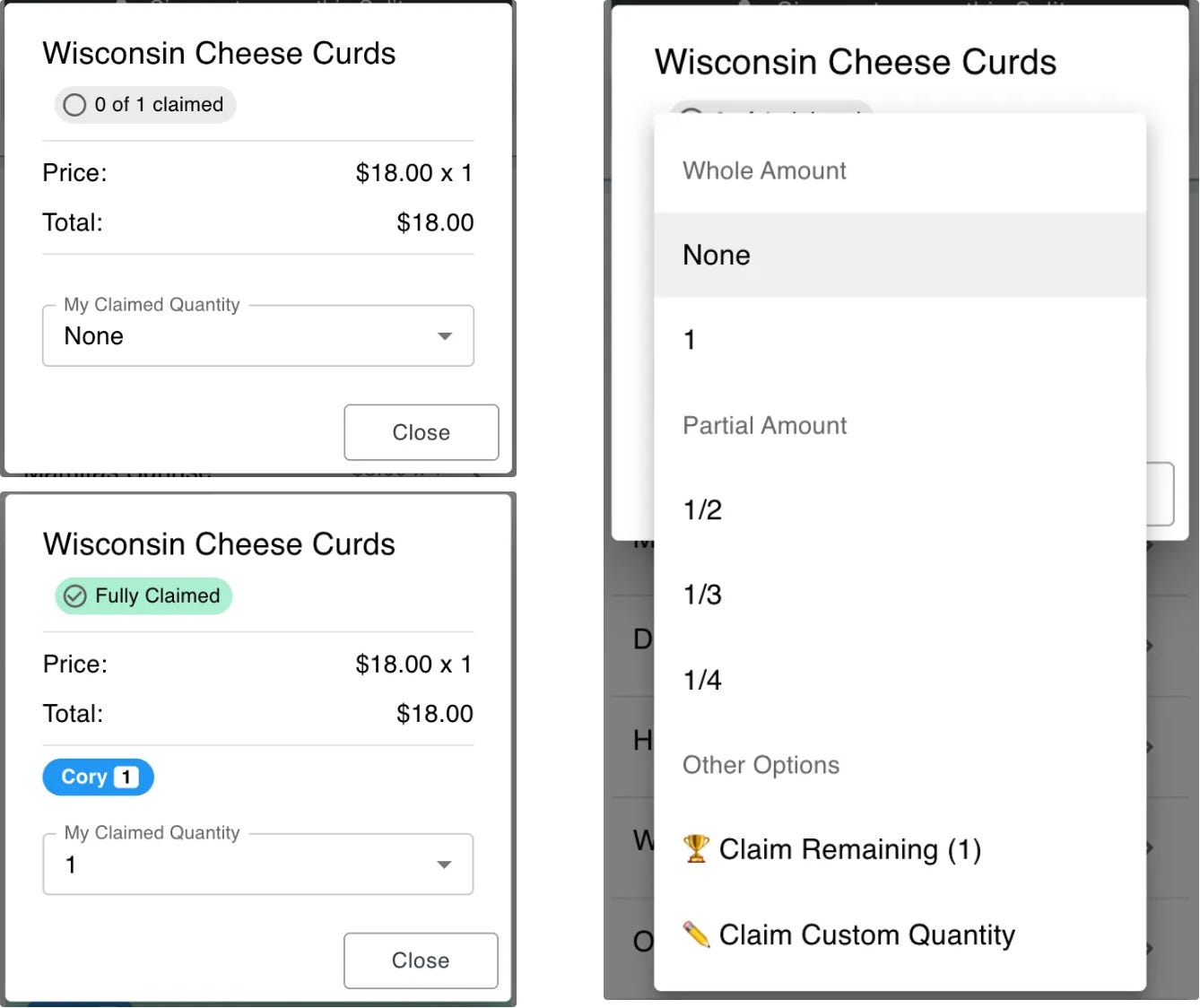
The problem I ran into is that most people (myself included) really struggle with fractions. While ½ is easy enough to work with, once you get into the complicated world of ²⁄₇, it gets really difficult. I’ve had that exact problem, where we split two pizzas 7 ways. In the original claiming system (which I built in 2019), you would have to claim ²⁄₇. But that was incredibly confusing, because you were having ⅐ of the pizzas.
For months, I did not know how to solve this problem. However, I realized that I did not have a great mental grasp of the problem I was trying to solve.
A few weeks ago, I started by outlining the problem. It was complicated to split items in all of the ways people wanted, but I had to categorize them if I ever wanted to make progress on fixing the experience. So I began categorizing, and noticed three distinct types of items that kept appearing on Split It bills.
The Single Item: A pizza, a burger, an order of wings, or an appetizer. Nachos to share. A single pitcher of beer. These items are pretty straightforward: either you claim a whole or you claim a part of it. It makes the splitting process easy.
Multiple Individual Items: 3 margaritas, 4 burgers, 2 chicken sandwiches, and 4 beers. For the 3 margaritas and 4 beers, those are obviously going to be claimed as wholes. Or if they are split, they are split between two people at the most. These are also pretty straightforward, as I can just show the whole quantities to claim, and a few fractions as a backup.
Multiple Items Split Multiple Ways: This is the category that kept me up at night. 2 bottles of wine split 7 ways. 4 pitchers of beer split 13 ways. 2 pizzas split amongst the whole table. The line item quantity was 2, but people didn’t care about this. They wanted to split it as one cohesive unit.
While #1 and #2 were pretty straightforward, and Split It handled them fine, #3 was very challenging.
For very long, I did not have an idea of how to split the #3 scenario. I initially tried to solve this with a dropdown that allowed you to do most of this, with a custom input for more advanced claims. But users still complained, which means it was still too complicated.
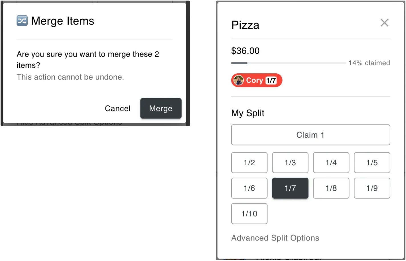
Instead of trying to solve the problem blindly, I leaned into the feedback from the power users. People didn’t want to split 2 pizzas 7 ways. They wanted to have a single line item called “Pizza”, and everyone could claim ⅐. It would be easier to claim them together as opposed to separately1. But that’s not how the system currently worked.
After clearly defining the splitting categories did the insight come to me. If the easiest way was to split them as one, why not give users a way to combine all of the line items into 1 line item? It wasn’t easy from a technical perspective, but it was clearly the best thing for the product. So I found a way to do it.
The new interface was born. Not only does it solve #3 better, it also made #1 and #2 simpler by inferring the context. No longer do users have to sift through a long list of fractions when the actually want to claim a whole item (#2), nor do they have to decide which of many fractions they need to use (#1). Now, splitting is as simple as selecting an item and clicking a quantity. Sure, there is need for more advanced splits, but not for a majority of the cases.
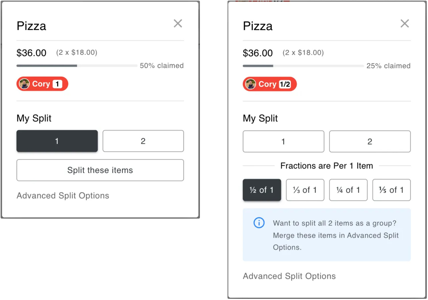
However, when you do need to solve an advanced splitting use case, you now have the option to do so. So claiming “Pizza” as a single line item is a breeze (#3).
This change improved the user flow #1 and #2, and made #3 intuitive and simple.
While this might seem like a small interface change, it fundamentally transformed how people interact with Split It. The beauty is that most users probably don't even notice the improvement, they just find splitting easier than before. That's exactly the kind of invisible enhancement that makes software feel effortless. And I’ll stress again that some of the smallest improvements create the biggest value for your users.
Additional Micro-Improvements
While the new claiming system is one I’m particularly proud of, I also ended up improving a lot of other parts of Split It recently. Some improvements came from user feedback, some came from observations as an admin, and others were just plain old bugs that need fixing. Each of these changes had a goal in mind, and I think each made Split It a better user experience.
Link Previews in Messages
If you’ve read my article on The Power of a Link, you’d know that there’s a lot you can do as a viral sharing mechanism. Previously, when someone shared a Split It link, they got a generic message describing what Split It does (left). However, what they really want is to make it easy to split the bill for a specific restaurant. Now, it reads as an invite from the person sending the message: “Let’s split the bill for Restaurant”.
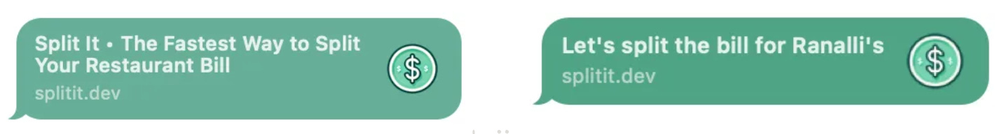
This link preview is a small change, but it helps users overcome the barrier of first-time use, and the natural skepticism that comes from a new app/website. I have always been happy with the Split It linkoff from messages → web, but I’ve always wanted to add this dynamic info to the message preview.
From a user’s perspective, it changes your mentality completely. Your attitude transitions from “this is a weird new app” to “Clicking this link will solve a problem our group has.” While subtle, I think it goes a long way.
Review & Edit Receipt before creating a Split
Since the introduction of the AI-powered receipt scanner, I have seen terrific adoption of the feature. It was the #1 requested feature since the dawn of Split It in 2019. With GPT 4o, I was able to build it, but as we’ve seen across the board with AI, often it’s not 100% correct. For the most part, it’s close to 90% correct, but I found this is not good enough.
Similar to what I said in AI and the Future of Interaction, I believe most AI-enabled flows will look like: intention → AI work → Visual confirmation. And yet when I redesigned this AI-based flow, I didn’t take my own advice. Until today.
The flow used to be: Enter # of People → Upload Receipt → Create Split. This was great in theory. But in practice, the Create Split step really needed to be Review & Edit. Maybe there was an item with the wrong price, or the restaurant had the wrong name2, and maybe there was nothing wrong at all. But whatever the state of the AI output, people needed a better visual way to verify their receipt was scanned correctly, and modify it if not.
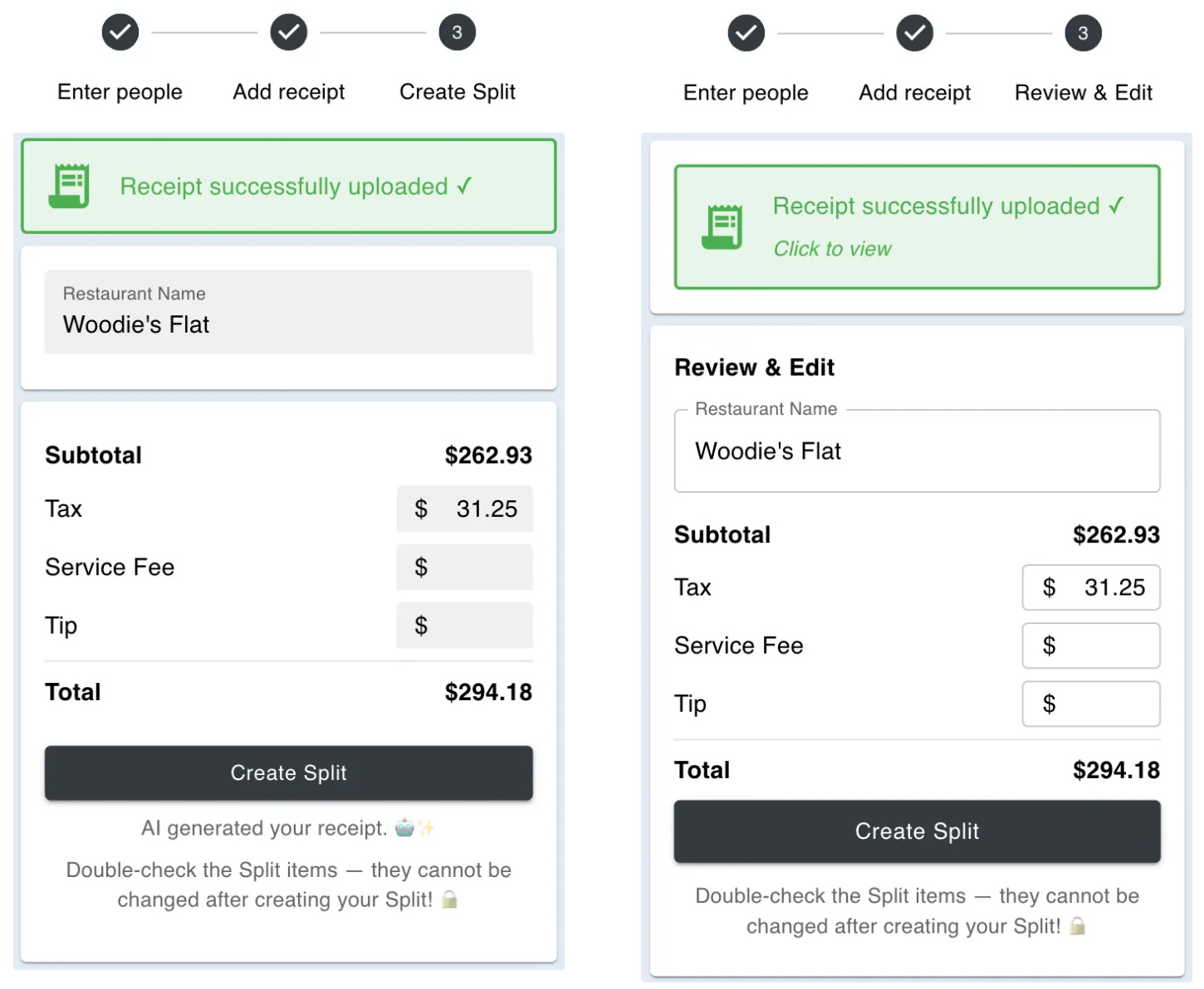
Before making this change, users certainly could review & edit. However, it was not very clear that they should review & edit.
Now, the first thing they see after the upload is a bold Review & Edit, which fundamentally changes how they think of the next step. This is a tiny micro-decision, but it completely changes the framing of this last step before creating the check. From “I have to click the Create Split button” to “I have to review and make sure this is all correct before creating.” Small and subtle, yet these decisions and nudges add up over time.
And with the intention of getting more people to review their checks, I added an additional nudge in the product. Now, after uploading a receipt, the screen scrolls down to the Review & Edit card, which makes it even more clear that they need to review the receipt before clicking “Create”.
Bug Fix: The Venmo Button
The main feature of Split It is (1) claim what you ordered → (2) pay someone back on Venmo. It’s a simple two-step process. But I recently got a bunch off texts from friends saying “the Venmo link doesn’t work” and “this is a just very fancy calculator if I can’t pay people back”3. They were right, as the user always is. The whole value proposition is for Split It to be an effortless way to pay people back. And if the Venmo link doesn’t work, then it’s useless.
It took me a while to identify the issue, but I realized that browsers were treating the link as a pop-up4. I was able to make a quick change and now the app is back to smooth sailing.
Bug fixes are an interesting thing. Sometimes they are there for a while and nobody notices, and other times they break the happy path of the app, and require immediate attention. This case was an example of the latter, and I probably should have identified the root cause and fixed it even sooner. But as a solo developer on a side project, sometimes it’s hard to prioritize these things. At least it’s fixed now, and the Split It users are happy again. Or at the very least, not texting me about the broken buttons multiple times a week.
Small Improvements, Big Value
As you were reading, I wouldn’t be surprised if you thought to yourself: “None of these changes seem particularly big.” And that’s the point. They are tiny in the grand scheme of things. And while non-power users may ever notice them, that is the goal. To build software so seamless that people don’t have to think about how to use it.
While it is tempting to find incremental improvements, it’s important to connect them back to a customer struggle. In the examples above, the customer pain-points were the complicated ways of splitting, the “try it” hurdle for new users clicking on a new link in Messages, and having the wrong amounts on their checks because they didn’t realize they had to review the output5.
If you’re building a product, always resist the urge to add features without understanding the real problem you’re solving. Instead, start with empathy, take it one step at a time (A, then B, then C becomes clear), and always ask “whose problem am I solving?”
While it’s hard to precisely quantify the value of any of these changes individually, when you take them as a cohesive product, it could potentially make the difference between a user becoming a paying customer, or just trying it once and never thinking about it again.
Every small improvement means I've learned something new about my users and solved another problem for them. I’m excited to keep learning, identifying incremental improvements, and solving more problems.
Today, I am very satisfied with Split It. That doesn't mean I think it's perfect or that I'll stop improving it. There will always be more problems to solve and incremental changes to make. But I've learned to find peace in the current state while staying excited about what's next.
Until next week,
Cory
So much so that I (and other Split It power users) started putting these types of items in as quantity of 1, because it was easier to claim ⅐ than ²⁄₇.
It’s even more important to get the restaurant name correct now that the message preview says “Let’s split the bill for {Restaurant Name}”.
In my defense, Split It is just a fancy calculator at the end of the day. I don’t claim that Split It is anything more than that. But then again, we are seeing GPT wrapper apps make millions of dollars while not building anything particularly novel. You don’t have to create new technology, you have to solve people’s problems.
For all my technical readers, when I rebuilt the app, I made the bonehead front-end move on my part was having that Venmo button be a div instead of an a tag. And the link opened within a button.onClick handler. So it would do window.open with a _target=blank. In other words, most modern browsers treated it as a pop-up. Because it was a pop up. Rest assured, the button is now a plain old href link, which does not act as a pop-up, and everyone can sleep soundly again.
Even though the app has a very clear disclaimer “Double-check the Split items — they cannot be changed after creating your Split! 🔒” it’s not surprising people don’t read it.
It was one of the hardest and most important product design lessons I’ve learned to-date: show, don’t tell.
In other words, people don’t read copy, so don’t have long, descriptions, paragraphs, etc. Instead, use the design of the software to draw their attention to what you want to see. Use small nudges to show them how to use the product.